Hi Welcome all, Here is the another tutorial about how you can Adjust or resize your Blogger blog width and sidebar width with various conditions using CSS code. Adjust the blog width is very important to look better as per your choice and it should be Responsive compatible. Here you can easily adjust blog width using CSS please follow the below tutorial.
There are two method to adjust widths of your blog, the first one is you can adjust width of entire blog and right side bar using "Blogger Template Designer" or "Blogger Theme Designer" but if you are using customised Blogger Template or third party Blogger Template, then you may not have this option in that case you need to use CSS and the second one is by using "Cascading Style Sheets" (CSS) Programming language which is a style sheet language used for describing the presentation of a document written in a markup language like HTML.
Adjust Entire Blog and Right Side Bar Widths (Blogger Theme Designer):
.mainblogsec {max-width: 800px;}
.sidebarrightnbt {max-width: 320px;}
It will set the blog post section width to maximum 800 pixel and side bar width to maximum 320 pixel, that means width of your blog should not exceed to the size you have set.
.mainblogsec {width: 800px;}
.sidebarrightnbt {width: 320px;}
It will fix the width of blog on any screen size, that means, the blog post section width will be 800 pixel and side bar width will 320 pixel which are fixed in any condition or size of the device screen.
Examples of Blog Width Adjust:
Style 1
/*--------------------------------------[CONTAINER]
*/
.containernbt {width: auto; max-width: 100%; margin: 100px auto; float:left; margin-left: 20px;}
.mainblogsec {max-width: 800px;}
.sidebarrightnbt {max-width: 320px;}
@media (max-width: 47.938em) {.containernbt {margin: 80px auto; }}
@media (max-width: 47.938em) {aside {margin-top:30px }}
If you use this CSS coding in your blog to adjust width, where width=auto and max-width-100% that means it will fit with the full size of the device screen and with the condition of left alignment and left margin 20px and your blog post width will be maximum 800px and right side bar width will be 320 pixel.
Style 2
/*--------------------------------------[CONTAINER]
*/
.containernbt {max-width: 1120px; max-width: 100%; margin: 100px auto; float:left; margin-left: 20px;}
.mainblogsec {max-width: 800px;}
.sidebarrightnbt {max-width: 320px;}
@media (max-width: 47.938em) {.containernbt {margin: 80px auto; }}
@media (max-width: 47.938em) {aside {margin-top:30px }}
In this case the size of the entire blog should not be exceed to 1120 pixel width with 800 pixel post section and 320 pixel right side bar and others will be same such as left alignment with 20 pixel margin.
If you want to center your whole blog then remove the float left and margin left, then the entire blog will center align with other width same as above described.
 |
| How to Adjust Entire Blog and Side Bar Width Of Your Blog |
Adjust Entire Blog and Right Side Bar Widths (Blogger Theme Designer):
 |
| Adjust Entire Blog and Right Side Bar Widths Using Blogger Theme Designer |
- Log in to your Blogger account and select the Blog you want adjust Widths.
- Now click on Theme on the left side panel of the blog.
- Then Click on Customize it will open the Blogger Theme Designer Page.
- Now click on Adjust Widths you well see two options Adjust width of Entire Blog and Right Side Bar. If you are using 3 Column layout Blogger template then you will have 3 parts of your blog to adjust.
- Adjust widths by dragging the button left or right or you can enter the size in pixel.
 |
| Adjust Entire Blog and Right Side Bar Widths Using CSS |
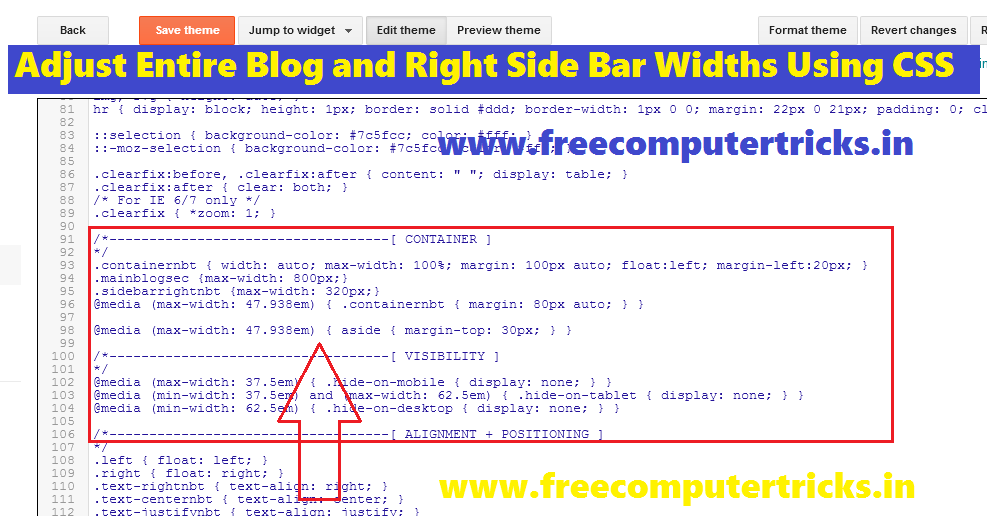
- Go to Theme ----> Edit HTML.
- Then find Ctrl+F .containernbt (in your case it's may different)
- Now add the below CSS code after it.
.mainblogsec {max-width: 800px;}
.sidebarrightnbt {max-width: 320px;}
It will set the blog post section width to maximum 800 pixel and side bar width to maximum 320 pixel, that means width of your blog should not exceed to the size you have set.
.mainblogsec {width: 800px;}
.sidebarrightnbt {width: 320px;}
It will fix the width of blog on any screen size, that means, the blog post section width will be 800 pixel and side bar width will 320 pixel which are fixed in any condition or size of the device screen.
Examples of Blog Width Adjust:
Style 1
/*--------------------------------------[CONTAINER]
*/
.containernbt {width: auto; max-width: 100%; margin: 100px auto; float:left; margin-left: 20px;}
.mainblogsec {max-width: 800px;}
.sidebarrightnbt {max-width: 320px;}
@media (max-width: 47.938em) {.containernbt {margin: 80px auto; }}
@media (max-width: 47.938em) {aside {margin-top:30px }}
If you use this CSS coding in your blog to adjust width, where width=auto and max-width-100% that means it will fit with the full size of the device screen and with the condition of left alignment and left margin 20px and your blog post width will be maximum 800px and right side bar width will be 320 pixel.
Style 2
/*--------------------------------------[CONTAINER]
*/
.containernbt {max-width: 1120px; max-width: 100%; margin: 100px auto; float:left; margin-left: 20px;}
.mainblogsec {max-width: 800px;}
.sidebarrightnbt {max-width: 320px;}
@media (max-width: 47.938em) {.containernbt {margin: 80px auto; }}
@media (max-width: 47.938em) {aside {margin-top:30px }}
In this case the size of the entire blog should not be exceed to 1120 pixel width with 800 pixel post section and 320 pixel right side bar and others will be same such as left alignment with 20 pixel margin.
If you want to center your whole blog then remove the float left and margin left, then the entire blog will center align with other width same as above described.
Very great post. I simply stumbled upon your log
ReplyDeleteand wanted to mention that I havce truly loved surfing around your blog posts.
In any case I'll be subscribing on your feed and I am hoping
you write again very soon!
Thank you for your valuable comment and we are always trying to give good and quality articles in the blog.
DeleteThanks & Regards
Free Computer Tricks
Firmware Files